
-
Get involved.
We want your input!
Apply for Membership and join the conversations about everything related to broadcasting.
After we receive your registration, a moderator will review it. After your registration is approved, you will be permitted to post.
If you use a disposable or false email address, your registration will be rejected.
After your membership is approved, please take a minute to tell us a little bit about yourself.
https://www.radiodiscussions.com/forums/introduce-yourself.1088/
Thanks in advance and have fun!
RadioDiscussions Administrators
You are using an out of date browser. It may not display this or other websites correctly.
You should upgrade or use an alternative browser.
You should upgrade or use an alternative browser.
What are some TV stations that have kept the same logo for many years...
- Thread starter IM42A
- Start date


How many local TV stations leave out channel numbers to take into account that they are on cable or on streamed at their TV app.Many broadcasters market themselves as low-digit stations even though the reality is that they are on UHF and/or have a UHF PSIP channel, such as ABC7 in both Sarasota and Fort Myers (two different stations), NBC10 in Boston, and KESQ-3 (PSIP 42) and KMIR-6 (PSIP 36) in Palm Springs CA. At the end of the day, a low channel number is always preferable to a high channel number. CBS had to do the walk of shame when they were relegated to channel 62 in Detroit.
I can identify some of them like statewide PBS affiliates like Oregon Public Broadcasting, PBS Hawaii, NJTV, Nebraska Public Media are identifed by their statewide brand affiliation and not so much by Channel numbers because of Cable, streaming and OTA placements.
Or earlier where I mentioned NBC Bay Area, Note there are others like NBC Palm Springs which is managed by Entravision.


I lived in Bloomington IN, 20 miles north of Bedford, in that era. I can guarantee you that WLWD could not override WTWO under normal circumstances. Even when the Cincy stations and Channel 7 in Dayton were clear (a rarity; they were usually snowy) and the antenna pointed toward them, Channel 2 would be an unviewable mess with both WTWO and WLWD combined.And there are more. This one has to be WTWO-2 Terre Haute, not WLWD (now WDTN), both NBC, both channel 2.
View attachment 3157

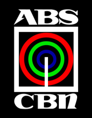
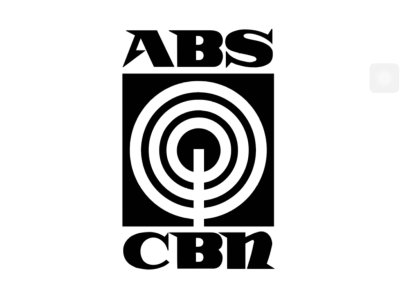
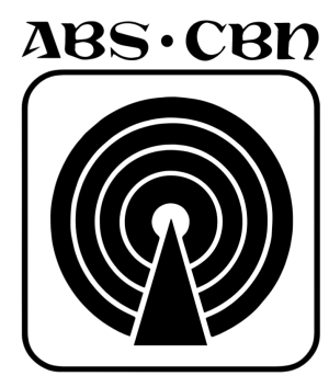
ABS-CBN
ABS-CBN (an initialism of the network's former names, Alto Broadcasting System - Chronicle Broadcasting Network) was a Philippine commercial broadcast television network that is the flagship property of ABS-CBN Corporation, a company under Lopez Holdings Corporation, ran by the López family...
 logos.fandom.com
Here is one of the Philippines longest running TV Network Logos the ABS-CBN Logo. Note there is a gap between 1972-1986 when the network was banned due to the Marcos Administration declaration of Martial Law.
Here are the logo over the years.
And note ABS-CBN still exists but this time mainly on Cable and streaming TV apps in the Philippines. It was due to a congress and the Duterte Administration going after the license of the network. Note in the Philippines broadcasting licenses are by network.
Note the networks former O&O's are under permits by other companies.
Attachments

Last edited:
KDKA doesn't quite use the same "2" as KCBS and WCBS, as you noticed in the above pictures. I believe it's in the Helvetica font family, but the thickness of the "2s" are different. Just below is WBBM-TV's current logo; it's not as thick as K/WCBS' "2"s, it's just bit condensed.
View attachment 3049
Back to Los Angeles...KTLA's present logo has been around 2009 (tweaked in '15), but it's a variation of their 1981-97 logo...
View attachment 3051View attachment 3052
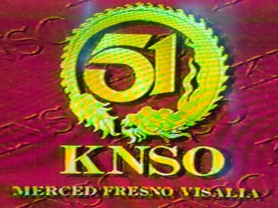
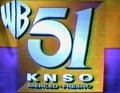
KNSO
The 5 used in this logo was based on KTLA's vintage 5 used from 1981-1997; and since 2009. In 2001, KNSO switched its affiliation from The WB to Spanish-language network Telemundo; WB network programming moved to KFRE-TV. In 2003, the station was acquired by NBC. In 2004, NBC rebranded the...
logos.fandom.com
Here are some interesting ones KNSO-TV Fresno now a Telemundo affiliate managed by NBC at one point borrowed the KTLA 5 Logo in the late 1990's. Once the station got the Telemundo affiliation they had to drop the KTLA look from the KNSO-TV Logo.
Attachments
WCVB-5 Boston's "5" logo has been in use since they began operating the station on March 19th, 1972.
WCHS had the ei8ht logo, as did WJW.They are one of several stations that do a variation on the Circle 7, not exactly like the ABC logo.
It may just be my imagination, but the KSWO and WBBJ logos look just a little different from the ABC Circle 7, and I refer to dimensions, not color. The number 7 lends itself to being cleanly depicted within a circle, with the three ends touching the circle, in a way that none of the other channels 2 through 9 do.
WGHP also had a pretty cool logo, helped by the fact that the number 8 is similar to the small-case "g":
View attachment 3061
WCHS in Charleston WV had a similar logo, but I can't find it. This logo used to be on the matchbooks at Shoney's:
View attachment 3062
I liked that logo better than the current one. That logo was slightly ahead of it's timeAnd before its present one, WFTV had a logo it had been using since the late '60s.
Not to mention that in the WLW-D days, the Dayton station's power was kept lower than optimum because of co-owned stations in Cincinnati and Columbus.I lived in Bloomington IN, 20 miles north of Bedford, in that era. I can guarantee you that WLWD could not override WTWO under normal circumstances. Even when the Cincy stations and Channel 7 in Dayton were clear (a rarity; they were usually snowy) and the antenna pointed toward them, Channel 2 would be an unviewable mess with both WTWO and WLWD combined.
WXIA's 11 in Atlanta had a logo for near thirty years till they changed a couple of years back.
 View attachment 3495View attachment 3493
1993 updated 2004-2019 updated 1995-2004
And WHDH Boston have the same logo as WSVN since Sunbeam took over the station back in 1993. This is one of the oldest logos in Boston too along with WGBH inc and WCVB-TV.My default pic should say it all for my favorite station...
WCKT/WSVN since 1976. However, its legendary for the 1983 circle 7 red version that still stands today. My favorite.
View attachment 3149

WHDH
Channel 7 from Boston was relaunched under a new license and ownership as WNEV-TV at 5:55 AM on May 22, 1982 after being sold from RKO General as WNAC-TV, although the CBS Affiliate stuck with this TV station until 1995. The call letters originally stood for New England Vision, derived from the...
logos.fandom.com
I would have expected a similar Channel 2 analog mess in parts of southern and south-central Illinois whose TV reception at least in the analog era was mostly fringe reception. This time with KTVI St. Louis and WTWO. Especially anywhere enclosed by at least a Pana/Shelbyville-Vandalia-Effingham-Flora-Salem/Centralia outlined area.I lived in Bloomington IN, 20 miles north of Bedford, in that era. I can guarantee you that WLWD could not override WTWO under normal circumstances. Even when the Cincy stations and Channel 7 in Dayton were clear (a rarity; they were usually snowy) and the antenna pointed toward them, Channel 2 would be an unviewable mess with both WTWO and WLWD combined.
I know this logo is associated with KUSA Denver and now WUSA Washington DC but this logo is longest running via unrelated affiliations and unrelated owners.
KMBC, WSOC and WSYR have used the "9" logo inside a circle. KUSA and WUSA use the 9 in associated with their respective affiliations. KMSP and KHJ-TV at one point used the "9" logo. Note it's more like that logo is used for syndicated purposes as far as I am aware of.
KMBC, WSOC and WSYR have used the "9" logo inside a circle. KUSA and WUSA use the 9 in associated with their respective affiliations. KMSP and KHJ-TV at one point used the "9" logo. Note it's more like that logo is used for syndicated purposes as far as I am aware of.
Attachments


And WKBW's current logo looks remarkably similar (outside of it being ABC in Buffalo) to what my local CBS (WSPA) had from 2001-2016 (when WSPA's news was still NewsChannel 7 [it became 7 On Your Side in the last 5 years of that logo's existence, before becoming 7 News in 2016 and adopting its current logo]).WKBW Buffalo when they were bought by Scripps had the same logo as their sister station in Detroit a circle 7 logo. They have recently changed to a new logo which looks somewhat like their original logo when they went on the air in 1958 but modernized.

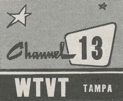
WTVT
WTVT Graphics and Logos WTVT first signed on the air on April 1, 1955, as a primary CBS affiliate on VHF channel 13 and the third television station in Tampa Bay. This colorful logo debuted in the 1966-67 Season and was used until December 31, 1975. It is interesting to observe that the CBS eye...
logos.fandom.com
The WTVT logo is the longest running logo in Tampa since 1989. This logo was also used at KOVR Sacramento and KERA Dallas at one point. But this logo is also used at WHBQ-TV Memphis.
Note WTVT had to remove the Searchlights as part of Disney taking over 20th Century Studios from Fox Inc in 2019. Note WHBQ keeps the Searchlights on the 13 logo as of 2022.

Last edited:

Here what I meant by other stations using the WTVT logo here is one from Dallas.

Here is one from Sacramento when KOVR was the ABC affiliate prior to 1995 when they became a CBS affiliate.
- Status
- This thread has been closed due to inactivity. You can create a new thread to discuss this topic.