
S
-
Get involved.
We want your input!
Apply for Membership and join the conversations about everything related to broadcasting.
After we receive your registration, a moderator will review it. After your registration is approved, you will be permitted to post.
If you use a disposable or false email address, your registration will be rejected.
After your membership is approved, please take a minute to tell us a little bit about yourself.
https://www.radiodiscussions.com/forums/introduce-yourself.1088/
Thanks in advance and have fun!
RadioDiscussions Administrators
You are using an out of date browser. It may not display this or other websites correctly.
You should upgrade or use an alternative browser.
You should upgrade or use an alternative browser.
S
Sammy Reed
Guest
The closest I found so far is BalanceUnicase.
The letters are the same height, upper or lower-case, so the capital T and R "work" with the other letters better.
https://www.myfonts.com/fonts/victory/balance/balanceunicase/
The letters are the same height, upper or lower-case, so the capital T and R "work" with the other letters better.
https://www.myfonts.com/fonts/victory/balance/balanceunicase/
I'm guessing that the Tanner font was hand drawn.
S
Sammy Reed
Guest
Yeah, either that or a modified version of a font.
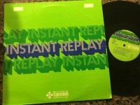
Their font for the cover of the Instant Replay library is just like Pentaprism 1 NF (https://www.myfonts.com/fonts/nicksfonts/pentaprism-nf/1/), except the right-hand line of the A overlaps instead of the left-hand one. Also, you have to type the small s instead of capital to match the Instant Replay cover.
Their font for the cover of the Instant Replay library is just like Pentaprism 1 NF (https://www.myfonts.com/fonts/nicksfonts/pentaprism-nf/1/), except the right-hand line of the A overlaps instead of the left-hand one. Also, you have to type the small s instead of capital to match the Instant Replay cover.
Attachments
Any list of fonts from around the 70's onwards has loads of capricious and arbitrary names, many being very minor modifications of the "standard" fonts from American Type Founders which controlled the hand-set type market for many decades.
Their list is at https://en.wikipedia.org/wiki/List_of_American_Type_Founders_typefaces
With the advent of computer graphics as well as the creation of systems like LetraSet, stylized and modified renamed fonts came from many sources. By the 80's, Adobe tried to standardize again with the Adobe Type Library, but by then there were too many imitations and variations as well as software that could take an existing font and apply changes, flourishes and modifications to it.
My grandfather was a commercial artist, active in the business from the early 1930s until his death in 1981.
I watched him do logos and graphics for a variety of clients (including Nalge, which makes those Nalgene bottles that are popular among hikers), and as often as not, the lettering he did was done by hand, especially for logos. Learning to letter was an important part of his education back then.
This is also why there's no true "Group W font" available from any of the type foundries. It was a (very) custom job done for the company in the early 1960s, and wasn't available to anyone else, so far as I know. The same was true of the Westinghouse corporate typeface. I don't know who did the typeface, but the W-and-dots logo for the corporation was a Paul Rand job, I believe.
My grandfather was a commercial artist, active in the business from the early 1930s until his death in 1981.
I watched him do logos and graphics for a variety of clients (including Nalge, which makes those Nalgene bottles that are popular among hikers), and as often as not, the lettering he did was done by hand, especially for logos. Learning to letter was an important part of his education back then.
This is also why there's no true "Group W font" available from any of the type foundries. It was a (very) custom job done for the company in the early 1960s, and wasn't available to anyone else, so far as I know. The same was true of the Westinghouse corporate typeface. I don't know who did the typeface, but the W-and-dots logo for the corporation was a Paul Rand job, I believe.
An interesting connection in both of our histories.
My grandfather was manager of the Chandler & Price company, at one time a major provider of movable type presses. I had one, and it helped finance my way into radio by printing business cards, letterheads, forms for my school and the like.
I bought lots of type and had type cabinets in the basement and learned the strange layout of them... different sizes of bins for more and less common letters. And I came in contact with companies that had custom fonts designed and produced at a foundry for use in all their forms... until offset came along. The fonts were drawn on high contrast paper and then processed like a offset photos were... an image on a plate and then an acid process. Then a mold was made from each letter.
Cleveland Trust had such a font... now part of what you know as Key Bank.
And newspapers would sometimes have their own font, with the molds made for Linotype machines. I saw the Plain Dealer's typesetting room... actually a whole floor... and it was impressive, noisy and hot!
- Status
- This thread has been closed due to inactivity. You can create a new thread to discuss this topic.